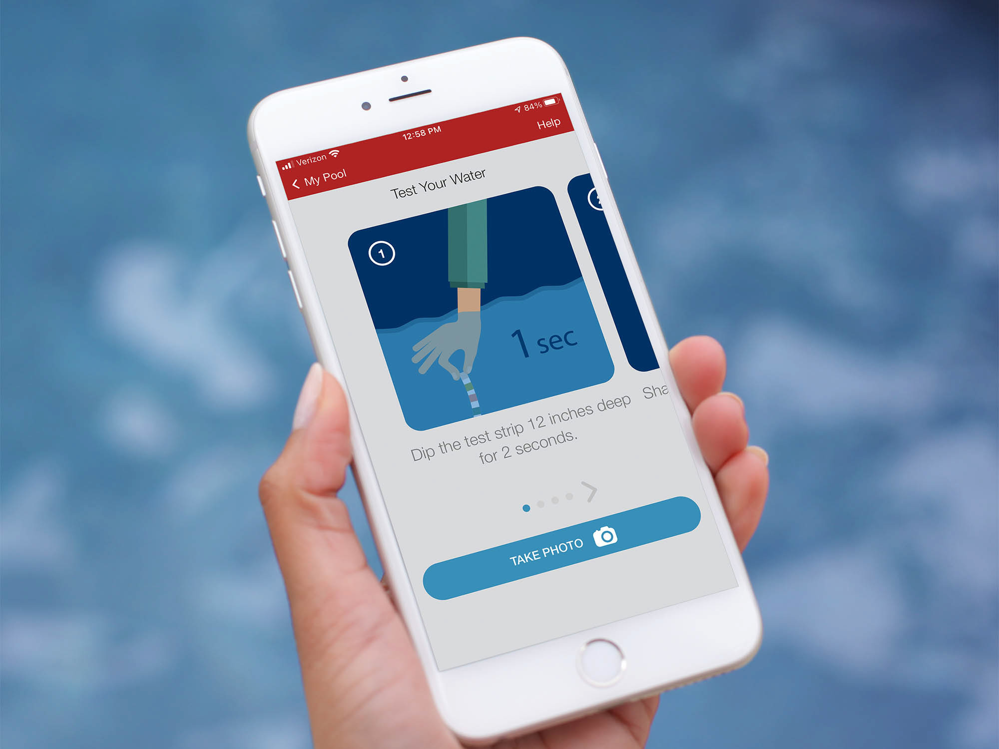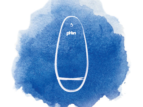
The original pHin Logo was designed in 2015 by a design agency. It served its purpose for 3 years and we all liked how it looks like 'pH in a water-drop' . Drawback of this design was the common mispronunciation of the company's name.
Instead of reading the logo as \ ˈfin \ sometimes it was misread as \ ˈpē-ˈāchˈ - in\. That was the main motivation for us to update the logo. Also for a fast-paced tech startup, we believed the grey in our logo is rather heavy, passive and slightly old. All this said, we didn't want a major change in word-mark or concept of the droplet.
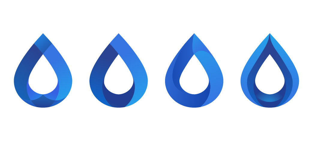
I tried to push the shape and colors of the water drop more into fresh, young and dynamic side.
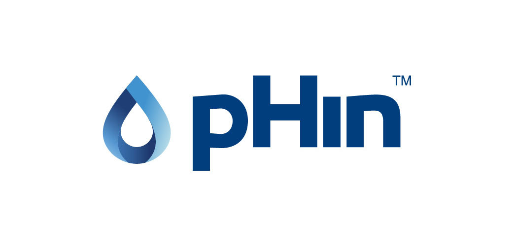
This is the the new logo. Same word-mark with updated spacings and a fresh droplet. No more grey color and blue gradients representing shades of blue water in different depths.
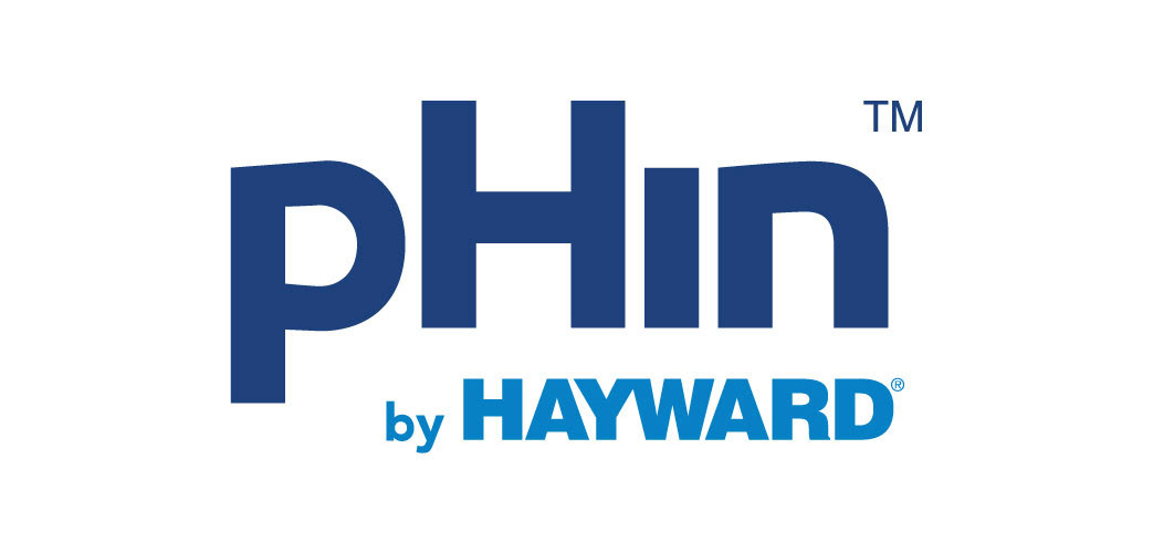
Later in 2018 when pHin company was acquired by Hayward Industries Inc., I created a combined logo of pHin and Hayward.